The Best Eyeshadow Looks for Blue Eyes vs. Brown Eyes
The classic advice is that warm, coppery eyeshadow tones make brown eyes look richer, while cool, blue-leaning tones make blue eyes look brighter — because colors that sit opposite each other on the color wheel create contrast, and contrast reads as saturation. It's a real effect, but it's a starting point, not a rule: eyelid shape, how deep-set or hooded your eyes are, and how much contrast you actually want matter just as much as iris color. The only way to know for sure is to see a specific look on your own eyes, not someone else's.
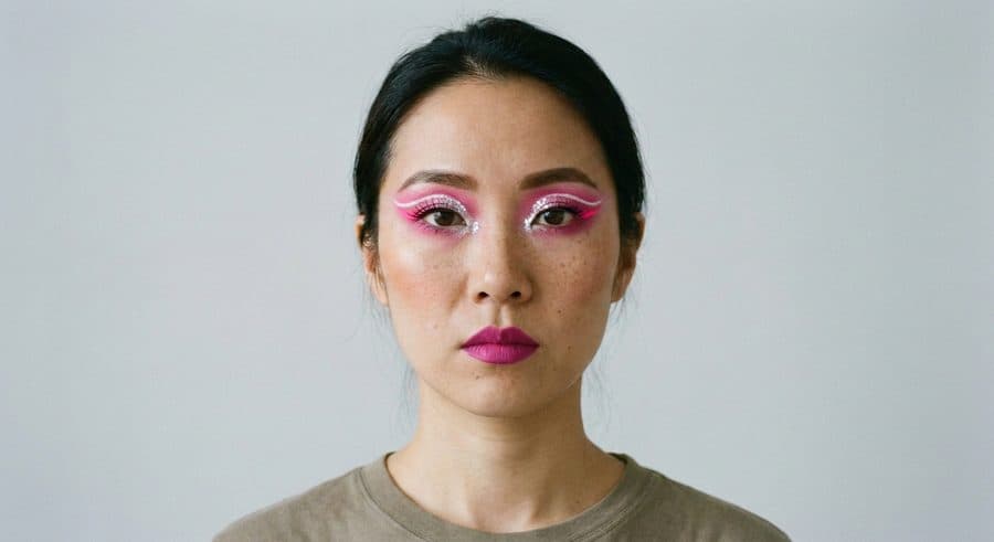

Electric Fuchsia Fantasy graphic eyeshadow rendered on a bare face — synthetic test photo, not a real person
Why the "complementary color" advice exists
Warm copper, bronze, and terracotta tones sit roughly opposite blue on the color wheel, so placed on blue eyes they create contrast that makes the blue read as more saturated. Cool tones — violet, navy, charcoal — do the same thing in reverse for brown eyes, contrasting against their warm undertone. This is genuinely useful as a starting point for a soft wash of color close to the lash line.
It matters a lot less once a look moves away from "soft wash of color" and into a deliberate shape or graphic statement. Electric Fuchsia Fantasy in the library is built around a bold neon shape rather than a subtle color wash — the shape and saturation are the point, not a calculated contrast with a specific iris color, which is exactly why graphic looks tend to work across a much wider range of eye colors than soft smokey ones do.
What matters more than eye color
Lid shape changes how much of any eyeshadow placement is actually visible once your eyes are open — a soft gradient built for a lid with visible space above the crease can all but disappear on hooded eyes, the same issue that shows up with winged liner. This has nothing to do with iris color and everything to do with anatomy.
How much contrast you actually want is a separate, personal decision from what supposedly "matches" your eye color. Sultry Gothic Glam gets its dramatic, vampy effect from a smudged dark base rather than from color-matching a specific iris shade, and Monochrome Duality is built to be deliberately monochrome and graphic rather than coordinated to any one eye color — both work by overriding the matching logic entirely instead of following it.
How to check what actually shows up on your eyes
Pick any of the looks above, or upload a screenshot of a different eyeshadow look you found elsewhere, and the system renders it onto your own uploaded photo — so instead of reasoning from color-wheel theory about whether a tone should suit your eye color, you see the actual result on your own lid shape and coloring.
Every result comes with a step-by-step tutorial and the product categories used. First three tries are free, no signup required.
Looks mentioned in this article
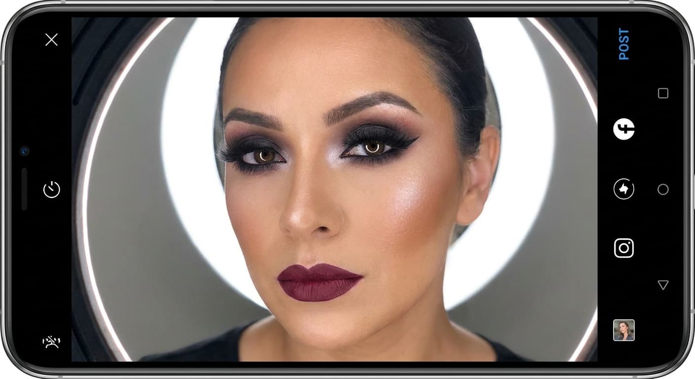
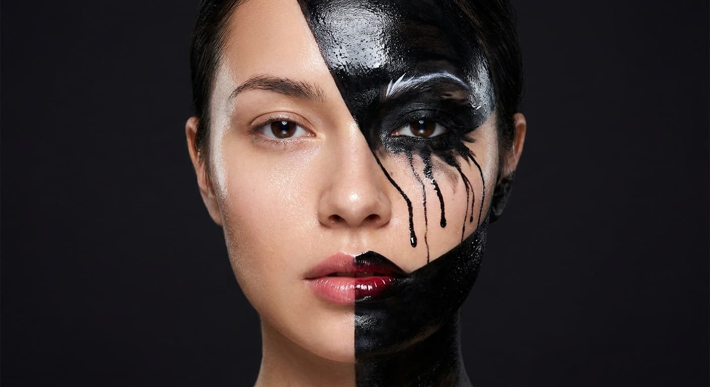
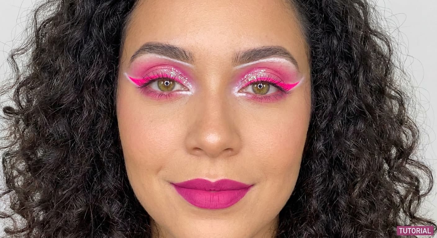
See it on your own photo — free, no signup required.
Try AI Makeup On Your PhotoFAQ
Does eyeshadow color really need to match eye color?
Not strictly — it's a useful starting point for a soft color wash, but lid shape and how much contrast you want matter just as much, and bold or graphic looks tend to bypass the "matching" logic entirely.
What eyeshadow colors work for both blue and brown eyes?
Neutral browns, taupes, and soft golds tend to read as flattering on most eye colors since they're close to a natural shadow rather than a deliberate contrast — they're a safe starting point if you're unsure.
Can bold or graphic eyeshadow skip the eye-color-matching rule entirely?
Yes — once a look is built around a deliberate shape or a single saturated color as a statement, the color-wheel contrast logic that applies to soft eyeshadow washes mostly stops being relevant.